Upside Travel Policy
Upside Business Travel allowed admins to have control over their travel policies without being too restrictive to be usable. Here's how we went about optimizing our policy offerings.
Upside Business Travel allowed admins to have control over their travel policies without being too restrictive to be usable. Here's how we went about optimizing our policy offerings.
Problem: Clients needed to be able to manage spending and ensure that their employees were booking vehicles that met the standards of their business.
Give admins more granular control over their policies without making the process too cumbersome or difficult to use. We also did a general test to ensure the copy on the page was not confusing to the user.
2/20-03/20
User Research, Prototyping, UX design
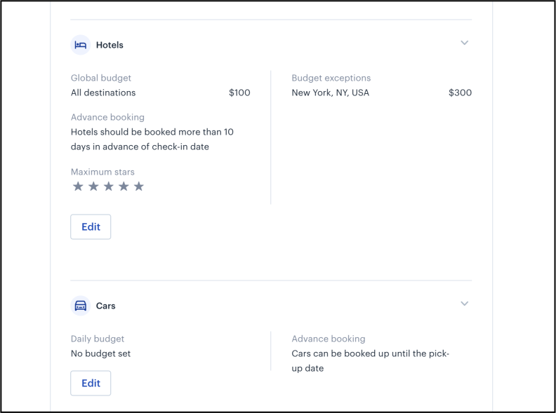
Before we started working on how to best add this feature, users were only able to set maximum price per day and the amount of time reservations needed to be booked in advance of their trip. We did competitive analysis, surveying, and testing to determine if our hypothesis was backed by user input and data


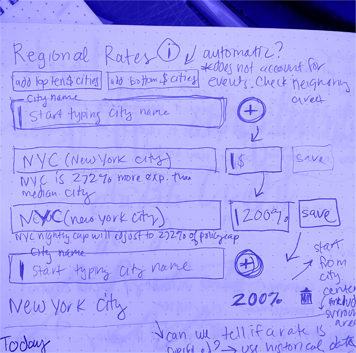
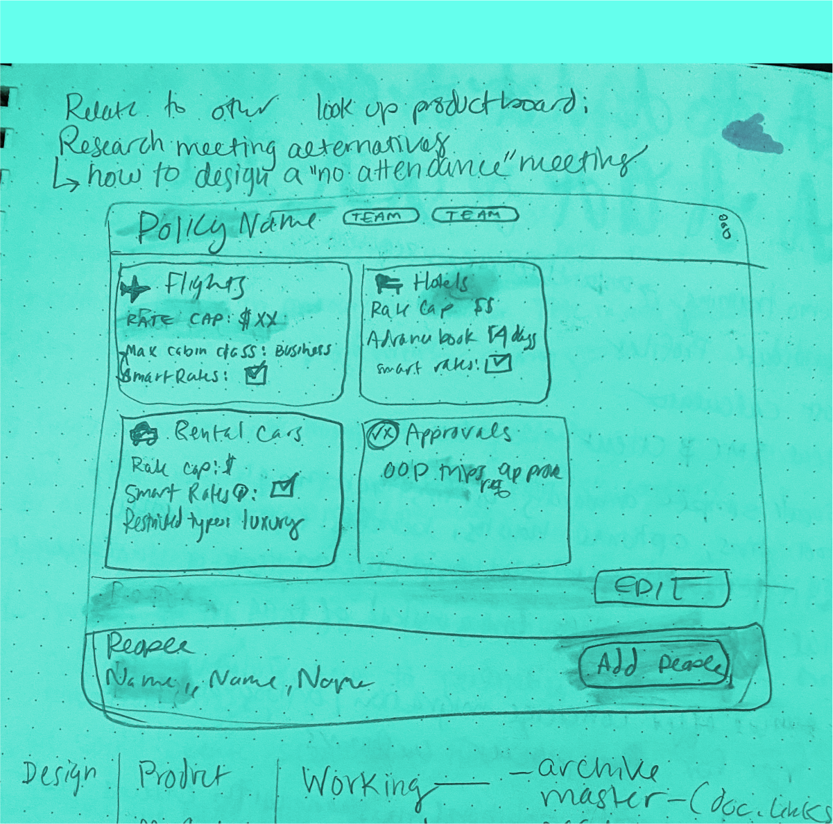
We explored a few different hypotheses including solutions for hotel pricing based on location, star rating minimums and, setting approved vehicle types for rentals. In order to keep the scope reasonable, we decided to investigate the latter two.
These were the proto-personas that we used to help guide our discovery process:
Adding more options for travel policy oversight will help admins keep spending on rental cars in the appropriate range as well as allowing them to insure that their employees are renting cars that meet the company's safety and quality standards.
Traveling is stressful, and knowing that your company is insuring my personal comfort and safety can increase productivity, and lower turnover rates. Making low-quality hotels unavailable helps keep employees out of dangerous areas and uncomfortable conditions.
We engaged in a number of research and testing methods in order to validate our hypotheses:

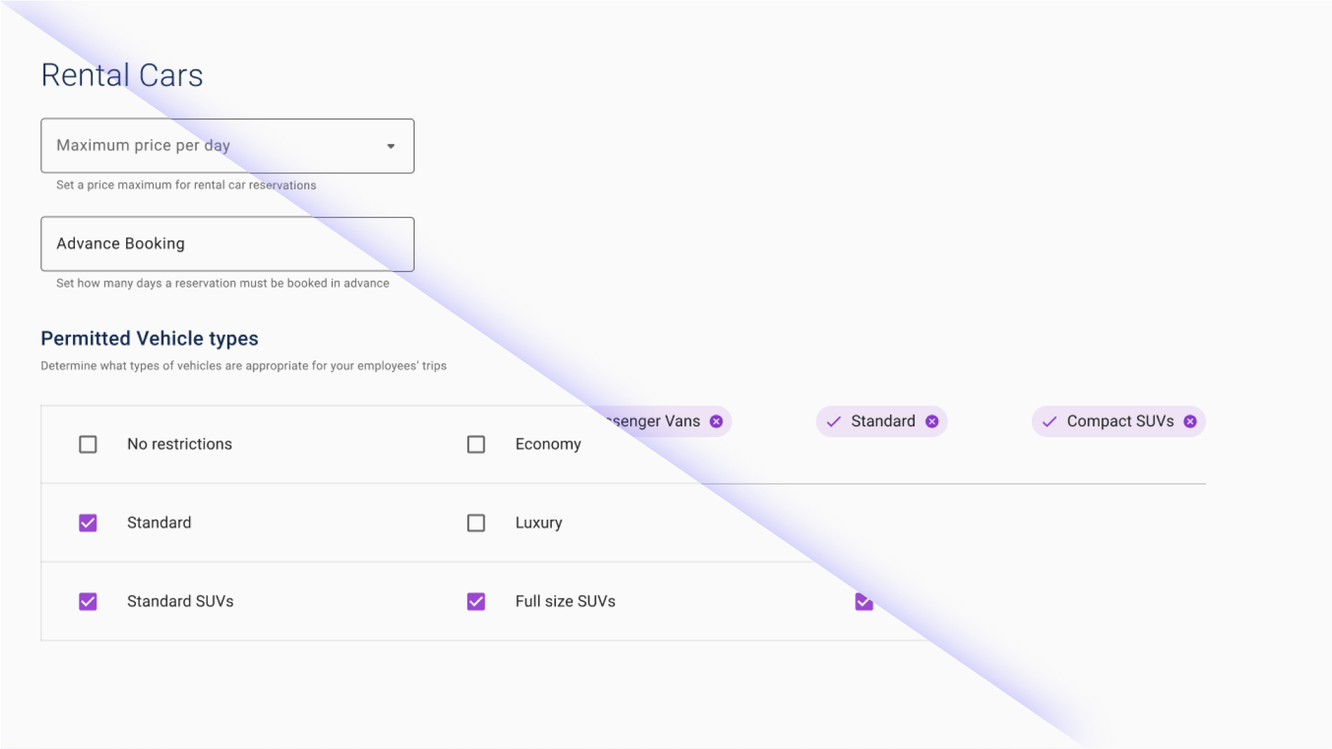
The user experience of this page was already working well for our customers. We worked through a few options and ended up testing these two options against eachother. The check boxes were overwhelmingly easier to understand based on user feedback. We implemented the check boxes and put a track on it to monitor it's usability.
