Purple. Design System
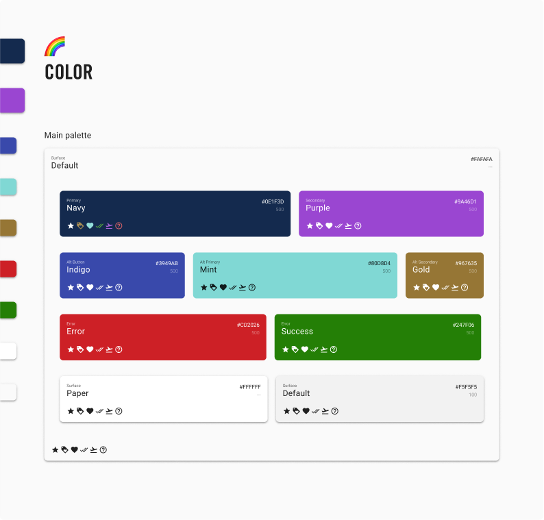
Prior to starting at Upside, teammates struggled with a lack of available symbols. We moved to Figma and created several extensive style and component libraries.
Prior to starting at Upside, teammates struggled with a lack of available symbols. We moved to Figma and created several extensive style and component libraries.
Problem: How can we create a system that is user-friendly for both designers and developers?
Create easy to use styles, components, and patterns libraries, encourage adoption among both designers and developers, create a foundation for future customization that better reflects our brand and user's needs.
1/21-08/21
Building out elements in Figma, training other designers on how to use Figma and create reusuable components, coordinating with developers
Prior to switching from Sketch to Figma, the designers had components that were a bit difficult to use, and not always in line with the components that the developers had access to. This lead to a lot of confusion. Developers would see a design in Sketch (for example, a button) and hard code it if it was designed differently than the component they had access to. This miscommunication resulted in inconsistent implementation of our system and lots of hard-coding that meant wide-spread changes would be extremely difficult to implement. Being a startup, there was little time to devote to this prior to my opportunity to join the team. My manager and I wanted to get this problem under control before it snownballed to the point that we would struggle even more to correct it.
The team was using Sketch. This made collaboration difficult, and contributed to a disconnected system. I, along with the Director of Design
Our goal was to improve communication between design and engineering.
We surveyed the design and engineering teams to find out what their painpoints were and how we could best address these needs:
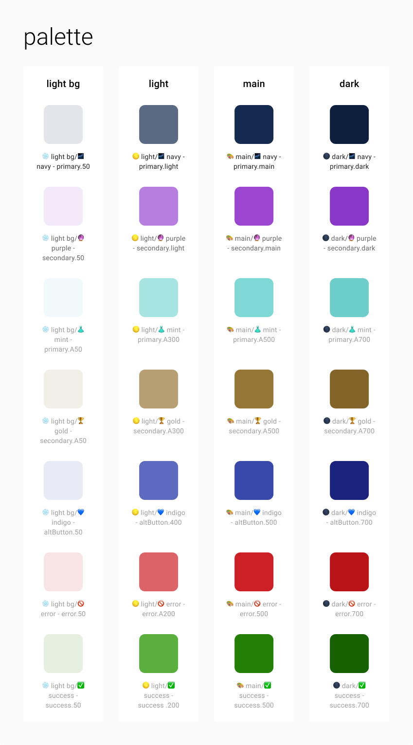
I created a foundational library of styles that allowed designers to use styles that the engineers had already set up in variable form.
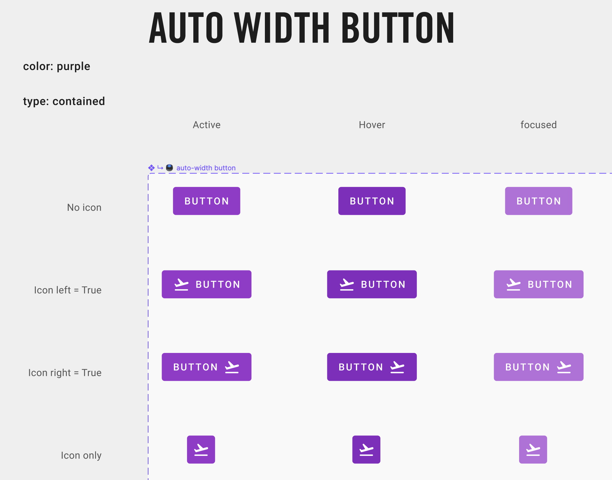
I created a component library that coordinated our design work with engineering and gave design and engineering a basis to improve consistency in the app.
I led a team of two designers in building a template library for pattern level components. We used the component library to build out common pattern level components like forms, inventory cards and more.
The previously mentioned team used these pattern level components to begin creating page templates that designers could grab and detach to make changes.
Our small team was working on developing a documentation site that would allow us to create a shared language between design and engineering.
Our goal was to create a single source of truth by evangelizing the system to increase adoption, and we were having success in gathering allies on the engineering team
Because we were able to update the styles library in Figma with relevant code information, engineers were able to access information more easily in Figma's inspect panel.
Many of these are the same, as the main goal is to improve communication and consistency.
The documentation site would have enabled engineers to grab code snippets in one place to ensure that the entire team was on the same page: no more unnecessary hard coding of colors or components.
There was inconsistent adoption of layout standards. The ultimate goal was to make sure that layout implementation was standardized, and responsive web layout was user-friendly.
Other personas included product managers and marketing designers. The design system team wanted to make the system available to non-product users so they could benefit from having a single source of truth to identify what was immediately possible versus what would require new, bespoke components.
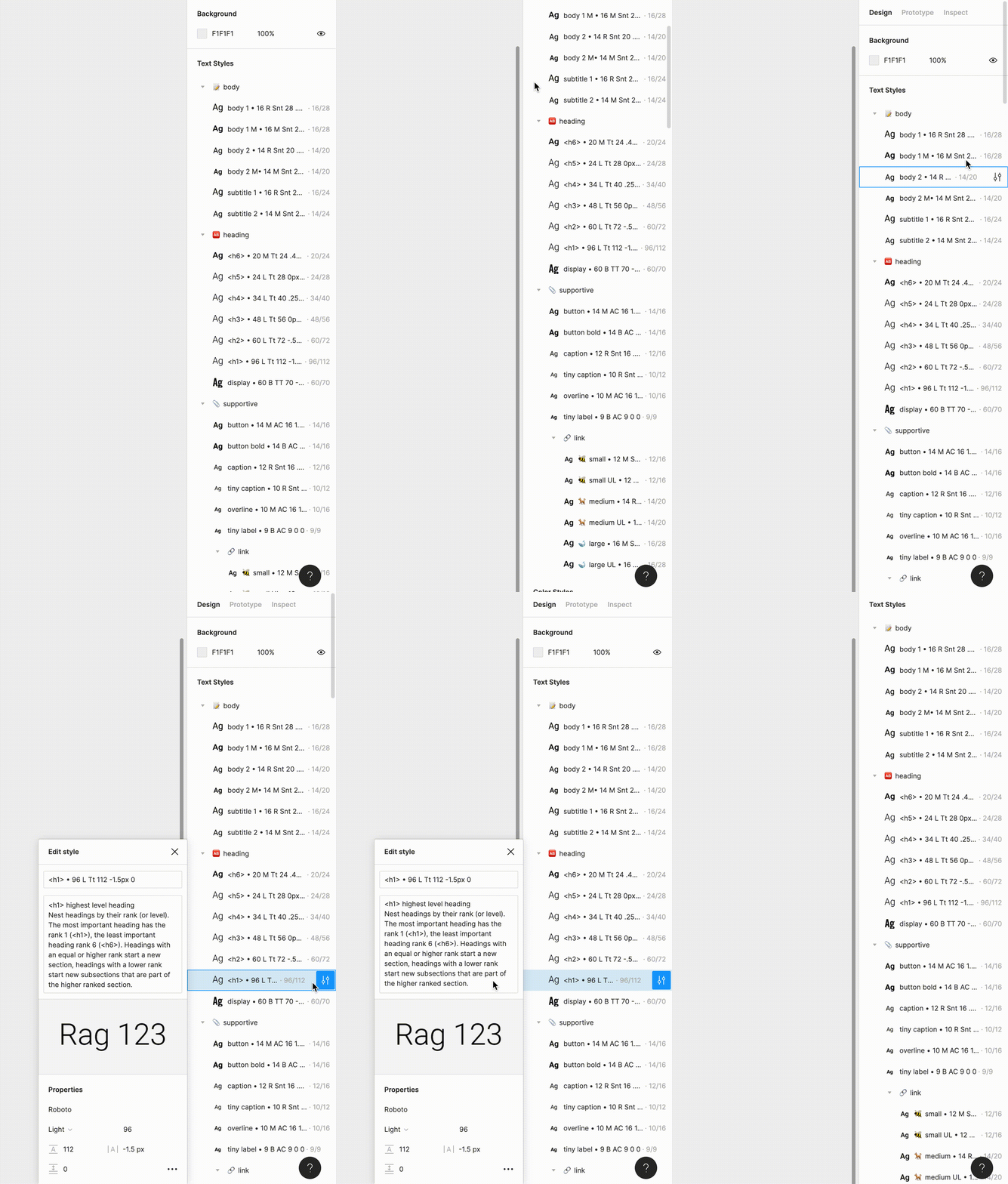
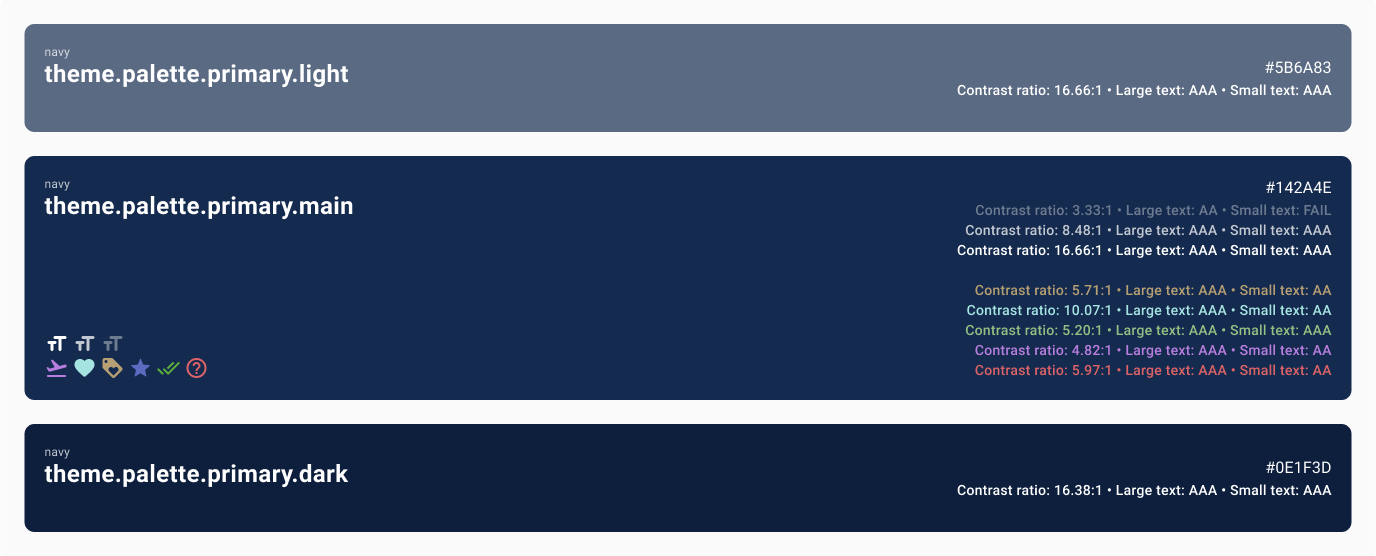
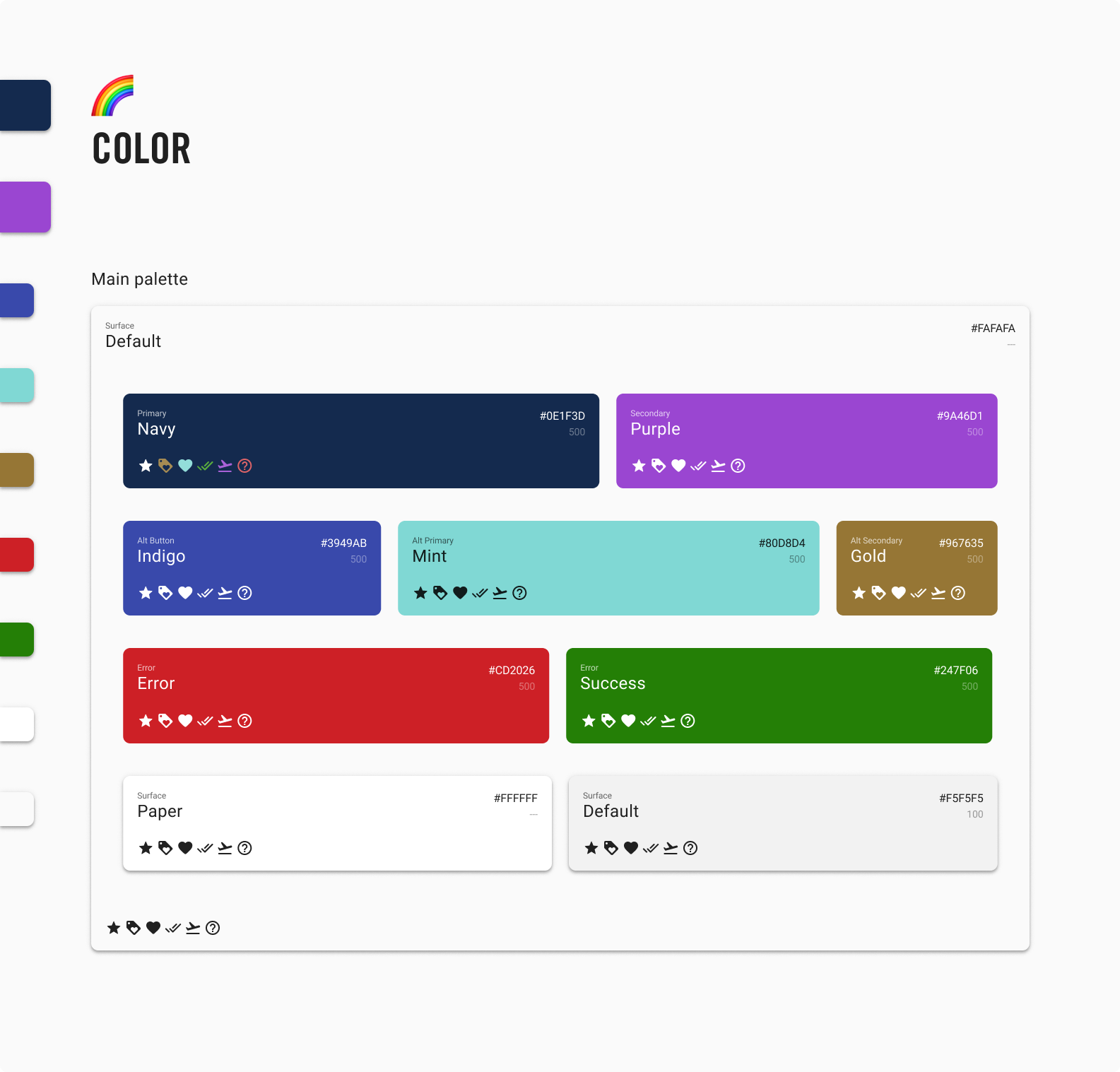
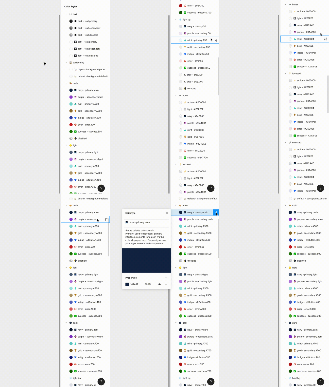
I created a complete, code-conscious library of styles that allowed the design and engineering teams to work together. This library made it easy for design to adhere to the current system that was used by the engineers.
I created a library of components that included everything from buttons to text fields. This library increased the design team's efficiency and allowed us to ship features much faster, and with better quality. Having components with appropriate autolayouts applied is great for engineering as well.
We were able to complete a number of commonly used pattern-level components and page templates while we were working on this project. These were very helpful for engineers and designers alike. We were able to use these to have a high-level overview of the product as well as to create new layouts more quickly.
During our tenure at Upside Business Travel, we were able to work together to create the beginnings of a great system. I led and organized a great team of engineers and designers who worked together to create efficient, useful libraries that helped the team to get features to market much faster than our previous system.
While our time together was cut short, working on this system was valuable experience for everyone involved. I enjoyed mentoring other designers on using Figma to set up responsive, complex components, and learned a lot about the tool in the process.