Upside Business Travel App
Upside's mobile app was developed as a convenient way to plan, book, and manage business trips. Improvements and feature upgrades were needed to keep up with the industry and polish our UI
Upside's mobile app was developed as a convenient way to plan, book, and manage business trips. Improvements and feature upgrades were needed to keep up with the industry and polish our UI
Problems: We were on a tight timeline to ship this feature due to pressure from the airline. My PM and I collected data on how often travelers were calling into the customer service center for help while on trips, and found out that almost no one was using the app while on their trips. The goal of this endeavor was to get MVPs in place for each feature, and create a scalable groundwork that could support multiple airlines—not just Southwest.
Assess the best MVP version for self service and plan for optimization for v2
02/21-4/21
User Research, Experience Design, Interface Design
Cancelations: Users were only able to cancel flights that met certain criteria in the app. This created some interesting problems to solve around how to notify the user if they were ineligible. Travel credits: Travelers needed to be able to check out with credits with RTFs when purchasing a Southwest Airlines flight. It's a feature that had to be added to the post-shopping flow due to technical restraints. We needed a way to display any credits they had available on their account, and set out to make sure anything we implemented would scale up to support multiple airlines.
My team rapidly developed this feature as an MVP that met requirements while tech debt was resolved. This meant I had to work with some difficult design/tech limitations.
We were on a tight timeline to ship this feature due to pressure from the airline. My PM and I collected data on how often travelers were calling into the customer service center for help while on trips, and found out that almost no one was using the app while "on-trip." Through interviewing users, we found that it was frustrating to have to call in and cancel when in a busy airport. This helped the product manager and I decide which of the three required features would be developed first.
I had inherited the app from designers who had already left the company. In addition, it had been neglected due to lack of resources that could be dedicated to the apps experience. Here are some of the challenges I faced when working through this problem.
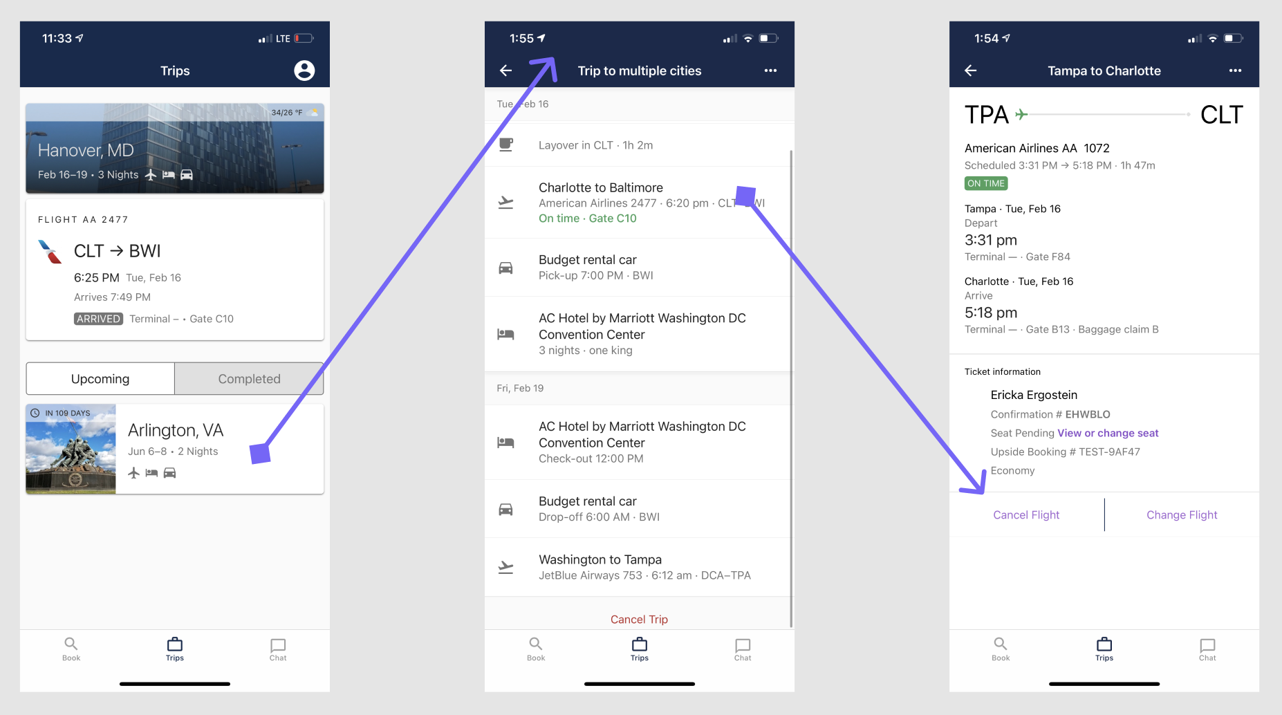
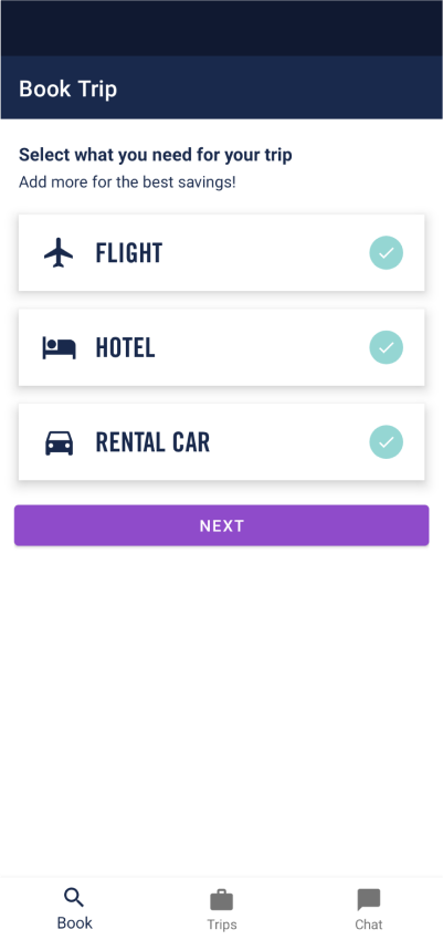
Due to the way the app was structured compared to the online shopping experience, I came up against some really difficult logistical challenges. A plan was in the works to refactor the shopping flow so we could clear up some of these confusing UX problems.
In initial "wireframing" (for efficiency's sake I used screenshots for much of this work), I was working off the assumption that the user needed to be informed of every piece of information tied to their potential cancellation. I tested this with users (UserTesting.com) and found that it was either ignored, or overwhelming.
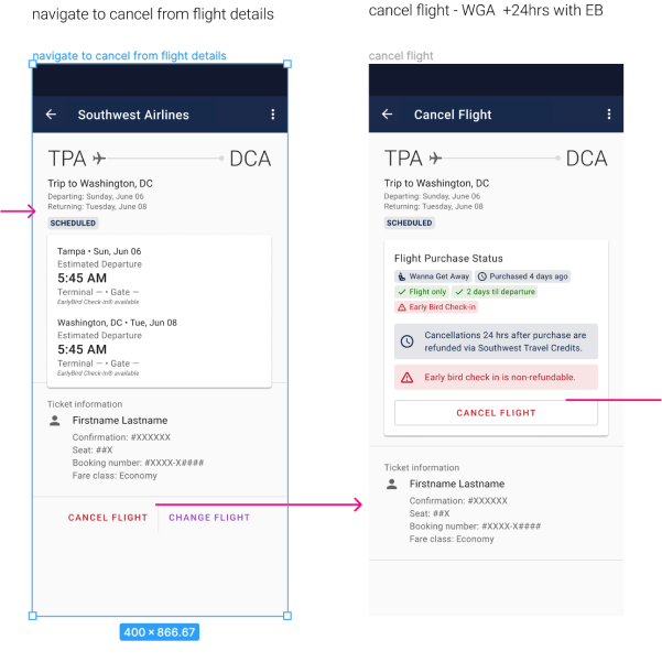
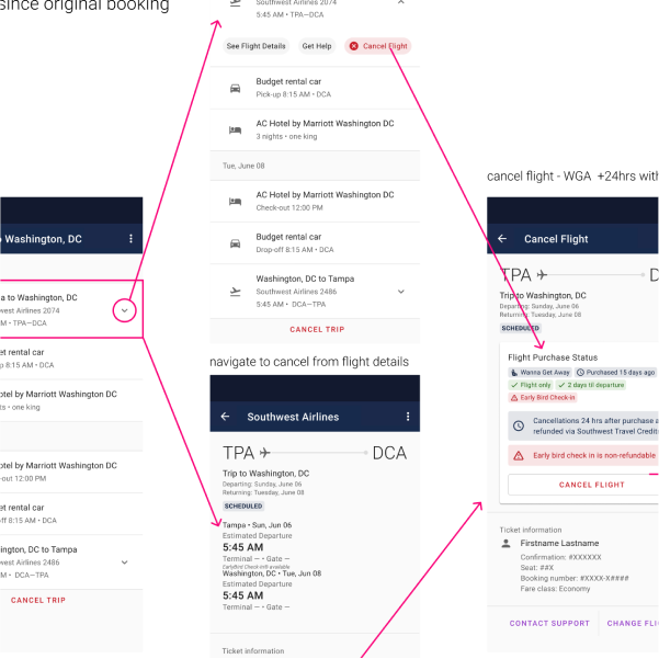
Here is when I started to run into problems. Because you can't cancel a single leg, or pull the data required to indicate a flight is eligible for cancellation, this experience becomes murky. I had a long whiteboarding meeting with other designers (sadly lost when the company shut down) and determined that without extensive work on the IA of the shopping and trips experience, we would have to settle for a bandaid in the meantime.
From there, I stripped out the chips, and reduced the number of inline messages to two options. This reduced the burden on engineering, and tested much better the second round. This iteration had a 3 second drop in time to cancel.
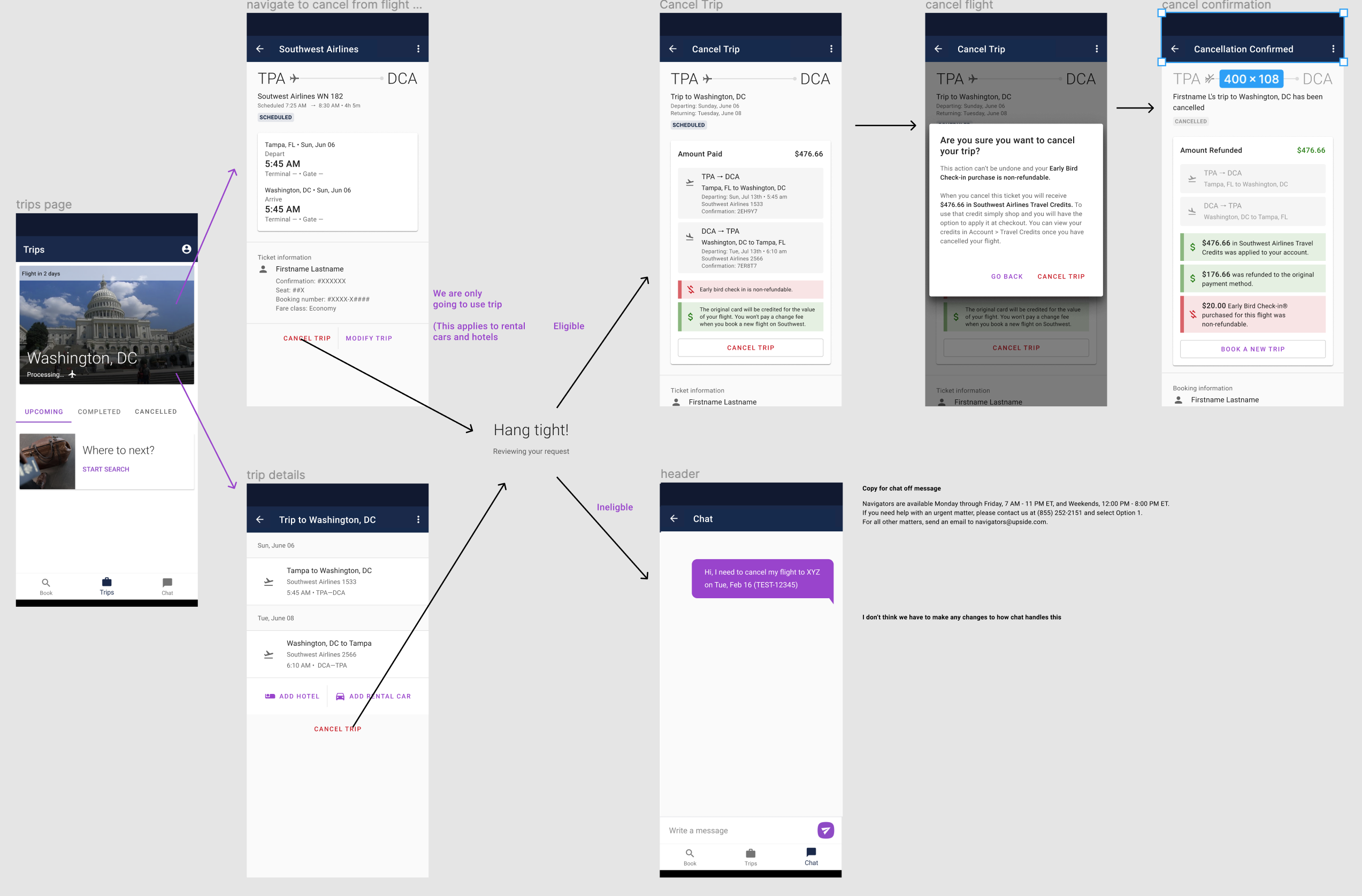
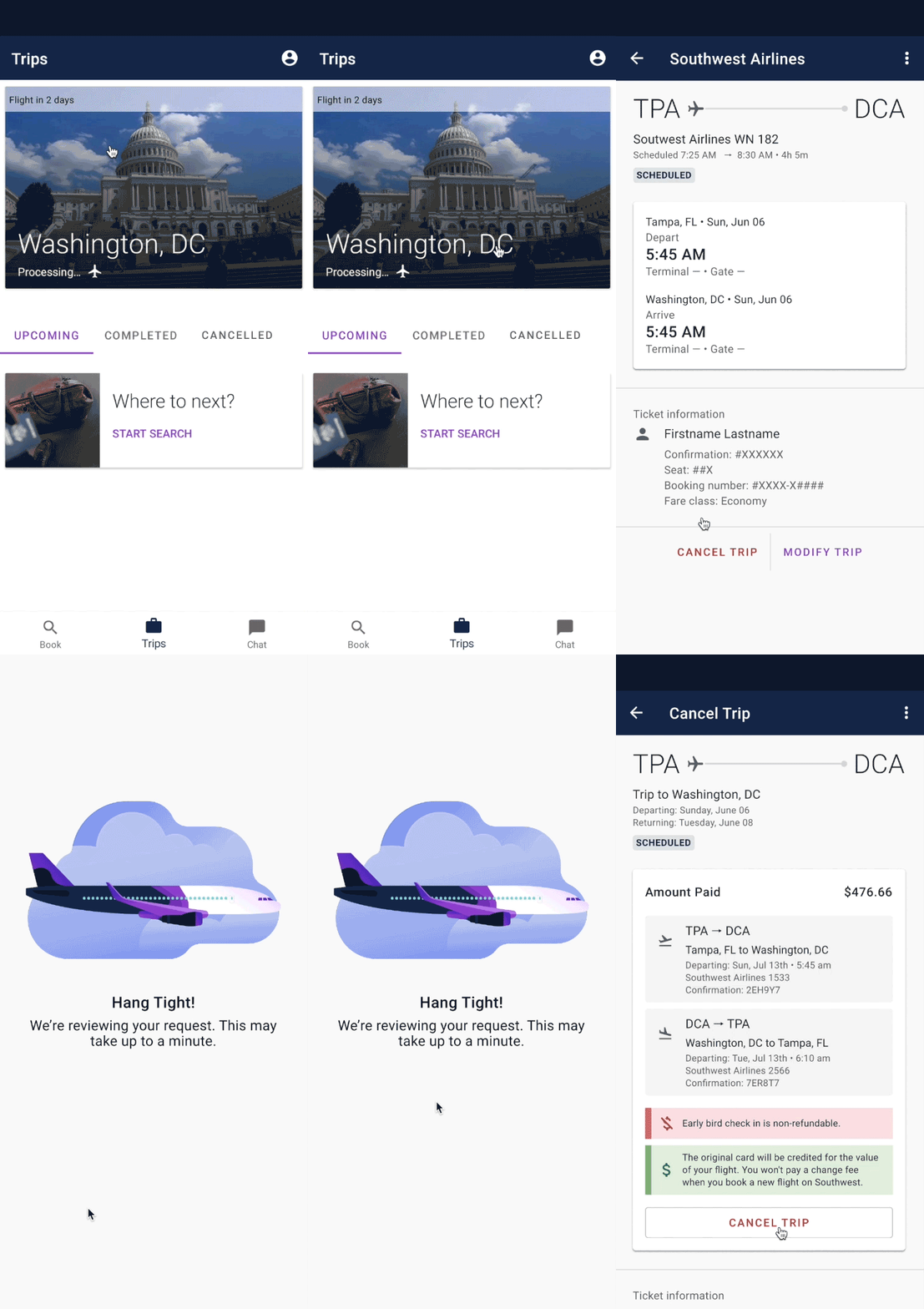
In the end, after consulting with my teammates (design and UX writing) I came to the conclusion that the best thing we could do for now would be to change the "cancel flight" language to "cancel trip." While not ideal, this would work well enough until we got through tech debt blockers.
Cancel trip on the itinerary screen always said "cancel trip." In addition, the user can only self-service cancel their flight if they only purchased a flight. My assumption is that will not be too confusing to see "cancel trip." if all you have in your trip bundle is a flight. Unfortunately, this is not ideal. I planned to follow up with users that cancelled flights using the app. Unfortunately, we weren't able to iterate on this part of the product before the company closed. >
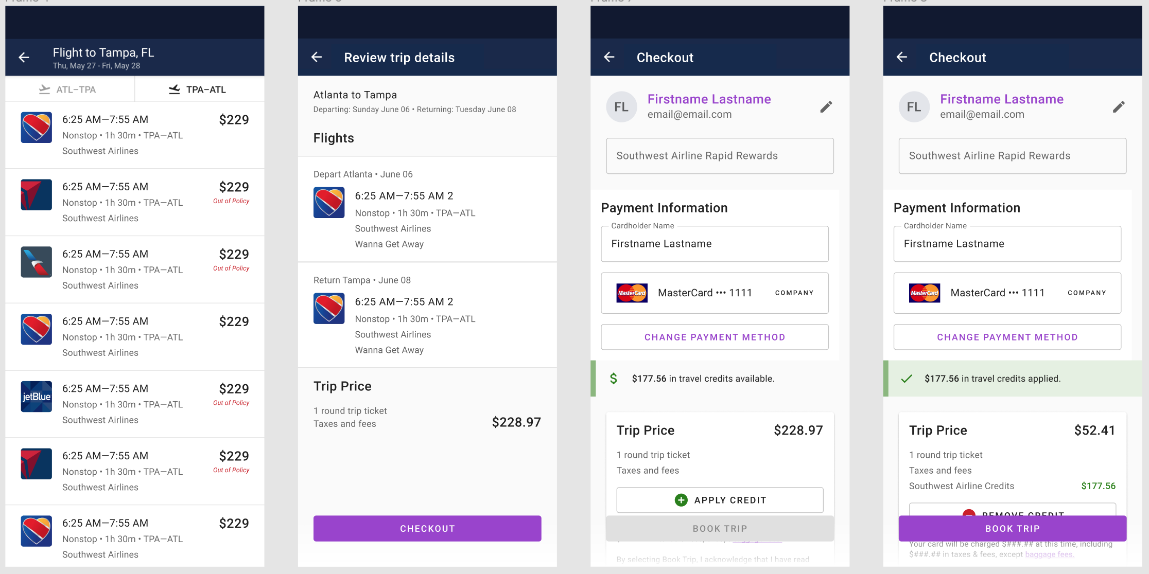
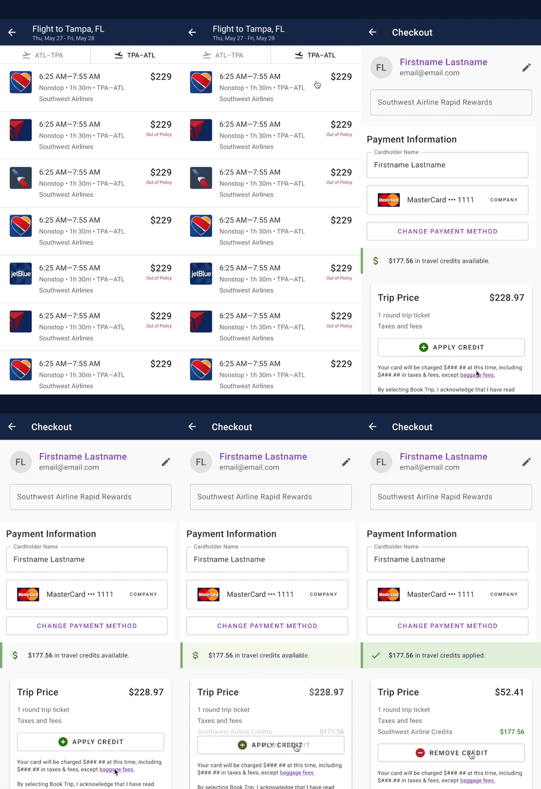
Now that users were able to cancel their flights in app, we needed to give them a way to view their credits and use them to make purchases. We already had this feature in our web app, and needed to extend the functionality to our mobile platforms. I set out to recreate the functionality of our web app with our mobile app users in mind.
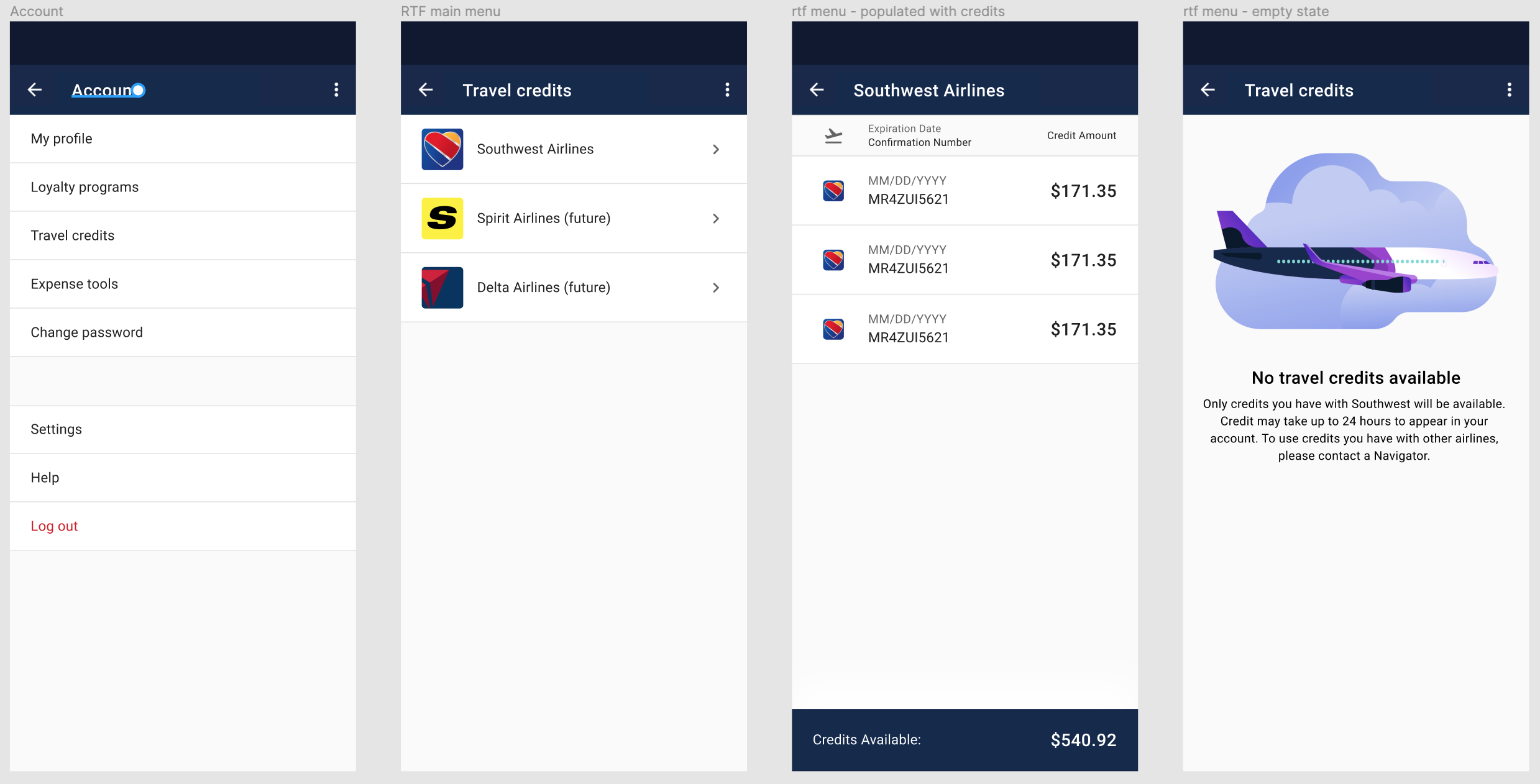
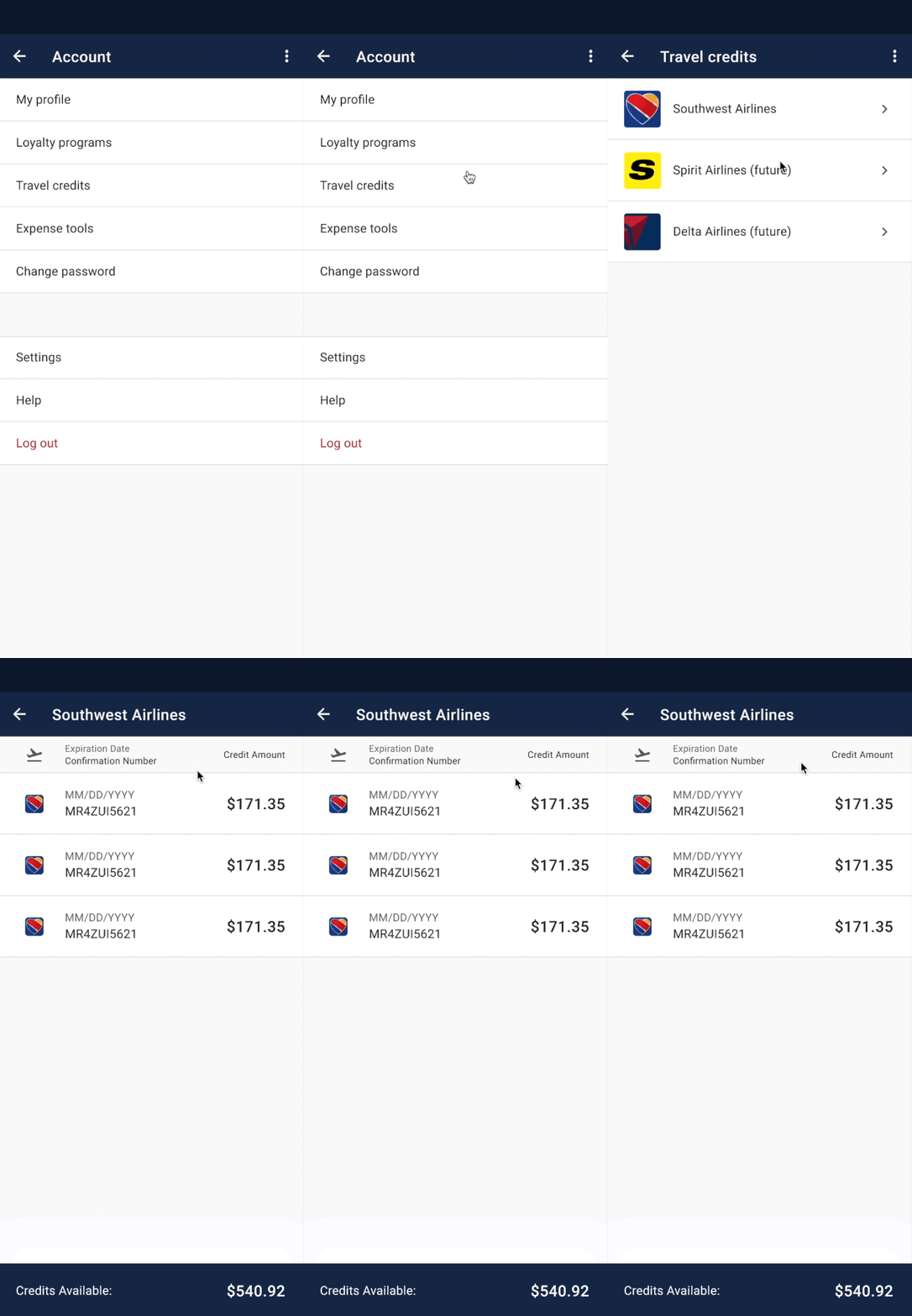
We were still on a tight timeline to ship this feature due to pressure from the airline. While this feature did not require much research as it had already been implemented in our web app, we spent a good deal of time ensuring that mobile best practices were followed. The amount of information in the travel credit menu posed a challenge on small screens. I also needed to solve for how the user would purchase flights with their credits.
As I mentioned earlier, there wasn't much research to be done beyond ensuring I was adhering to best practices. We simply needed parity with the web app, and this project was mostly UI work. That being said, it was quite a bit of information to convey on a small device.
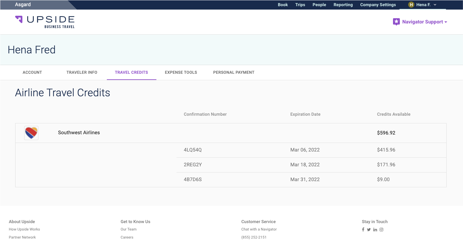
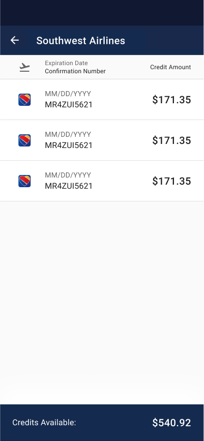
I was able to solve for translating the complexity of the table in our web app, and ensure that we had a scalable design that would allow us to support additional airlines in the future.
How I translated a checkout process from our web app to serve mobile users who are more likely to be in a distracting environment
We had this functionality in the web app as well. It was important to the company to achieve parity between the web app and the native app in order to encourage more bookings. The assumption in the past had been that no one really booked on the app. When we pulled the data, we found that this was false and about 10% of bookings came from the app. The app had been neglected in the past and we hypothesized that that number could grow. If we could add features that are only available in the web app, it should encourage users to plan trips on the go.
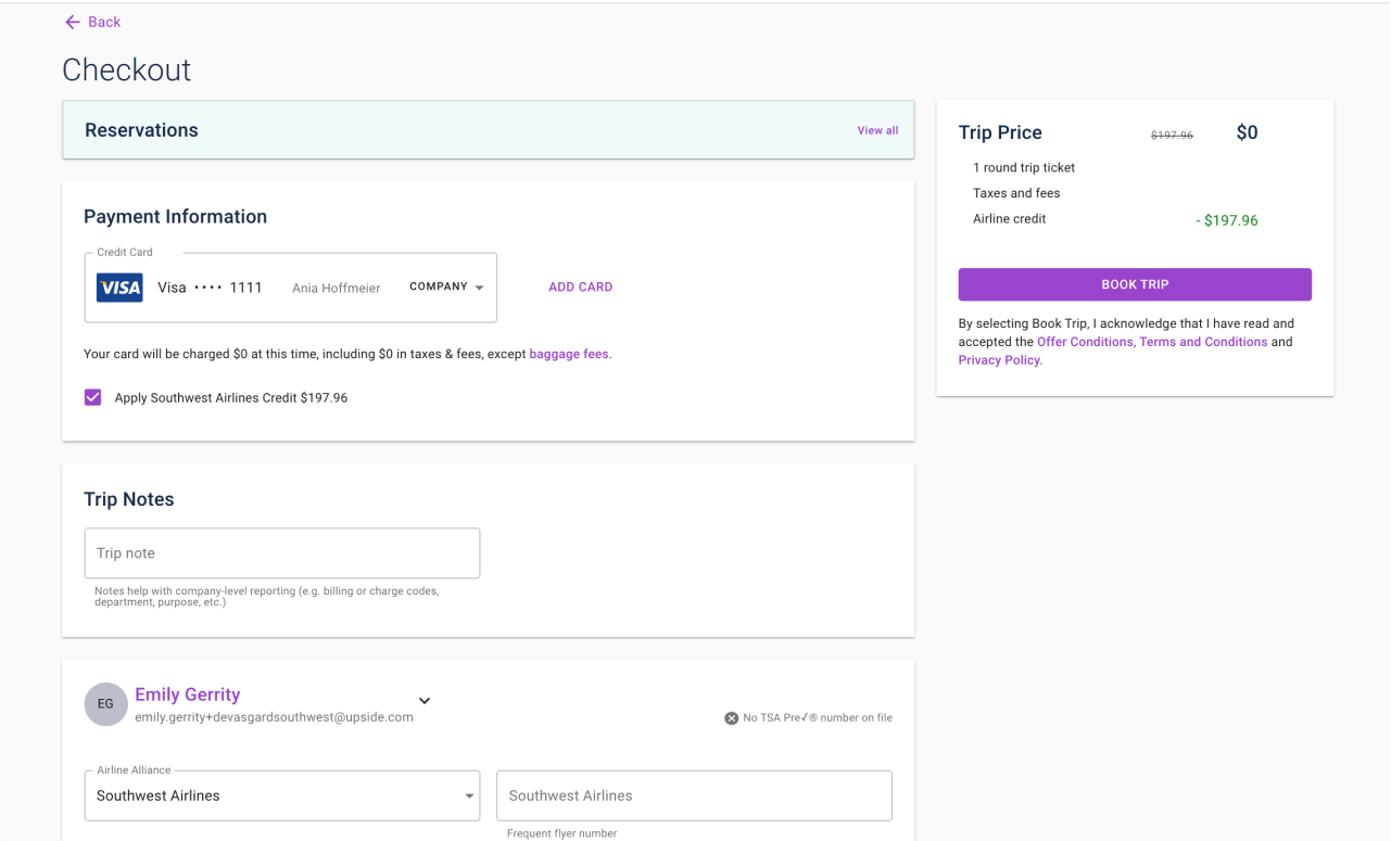
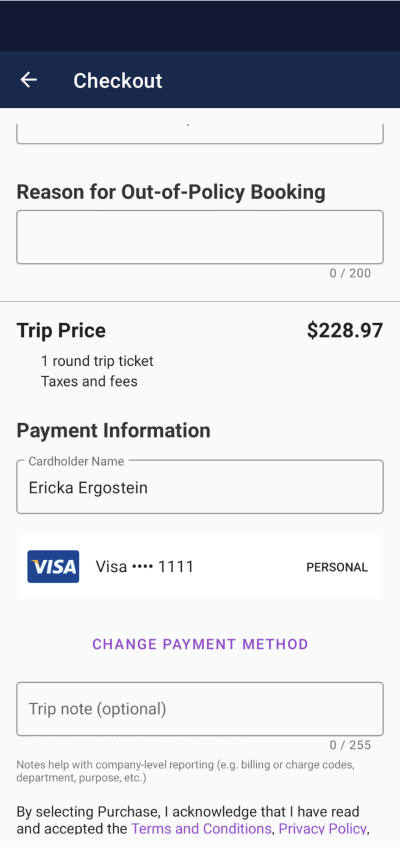
I successfully translated the web experience for mobile by drawing more attention to the available credits. The checkbox was hard for users to find when tested against the inline message. I also found that using visual color cues helped users move through the process a bit faster. In addition, we were able to rearrange the order of the elements in the checkout page in preparation for v2.
